|
|
Post by mainy on Jun 6, 2012 15:37:05 GMT -5
poster im working on for a short film im doing |
|
|
|
Post by Kuro on Jun 6, 2012 15:53:33 GMT -5
That looks very cool. I really like it. I like the surreal feel of it.
Makes the short film seem very interesting. You have to show it to us when you complete it.
|
|
|
|
Post by Shark a' Pult on Jun 7, 2012 17:09:58 GMT -5
Yeah that is well done Mainy, nice job.
|
|
|
|
Post by mainy on Jun 8, 2012 7:13:38 GMT -5
thanks guys, got good response from my fellow group members apart from 1 douchebag but meh hes stupid lol and my lecturers liked it so all good. the actual film has been filmed and a rough cut has been made, so should be done pretty soon. when its done ill see if i can get a copy and upload to youtube then post
|
|
|
|
Post by Shark a' Pult on Jun 8, 2012 7:52:45 GMT -5
Oh shit bro that's awesome. Thanks for letting us know.
|
|
|
|
Post by mainy on Aug 17, 2012 17:28:21 GMT -5
this was 3 films i was involved in making in a month media course i done vimeo.com/user12316350/videosand this is the behind the scenes of the course im the guy on the right in the thumbnail :P oh yeah |
|
|
|
Post by mainy on Aug 17, 2012 17:30:14 GMT -5
this is a poster ive been working on for a short film a group of young people made and i was one of a few interns who aided the youngsters in making the movie |
|
|
|
Post by Kuro on Aug 17, 2012 18:51:20 GMT -5
I see what you did there in Dream Bond. The posters in the background at the end.
I saw what you did there.
Rejected was the best. It was pretty good. I must say though, you and your group must have courage to wear those costumes and parade around in public. That is a compliment.
The INK poster is pretty awesome. I love the lighting of it. The neon word INK as well, I really like it. I think the subtitle "some characters just don't have enough depth" should be in the lower part of the poster though, I think it would be better if it was much lower and not so close to INK.
All in all, cool job with everything! Very cool. Good work.
|
|
|
|
Post by Shark a' Pult on Aug 17, 2012 19:22:53 GMT -5
I like the grainy look to it, it's really cool Mainy.
|
|
|
|
Post by mainy on Oct 7, 2012 15:41:11 GMT -5
just a quick sketch i done when bored  |
|
|
|
Post by Shark a' Pult on Oct 8, 2012 11:41:18 GMT -5
I like the details between the finger portions, it looks quite real.
|
|
|
|
Post by Kuro on Oct 8, 2012 15:47:51 GMT -5
You are on your way. The picture looks nice. :)
|
|
|
|
Post by mainy on Nov 14, 2013 21:26:00 GMT -5
random fake poster i done with me in it ]  another fake poster i done ] 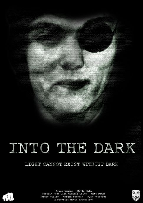 chalk pastel drawing i done a bit ago ]  |
|